Edenfantasysのパッケージデザイン / EdenFantasys – Packaging Design


To create the main visual for the packaging, I first conducted a brainstorming session to analyze the product’s functions and purpose, then distilled them into three key elements.
- The primary function of the product is vibration.
- The area of use is specific parts of the genitals.
- The sensation and emotions it provides during use.
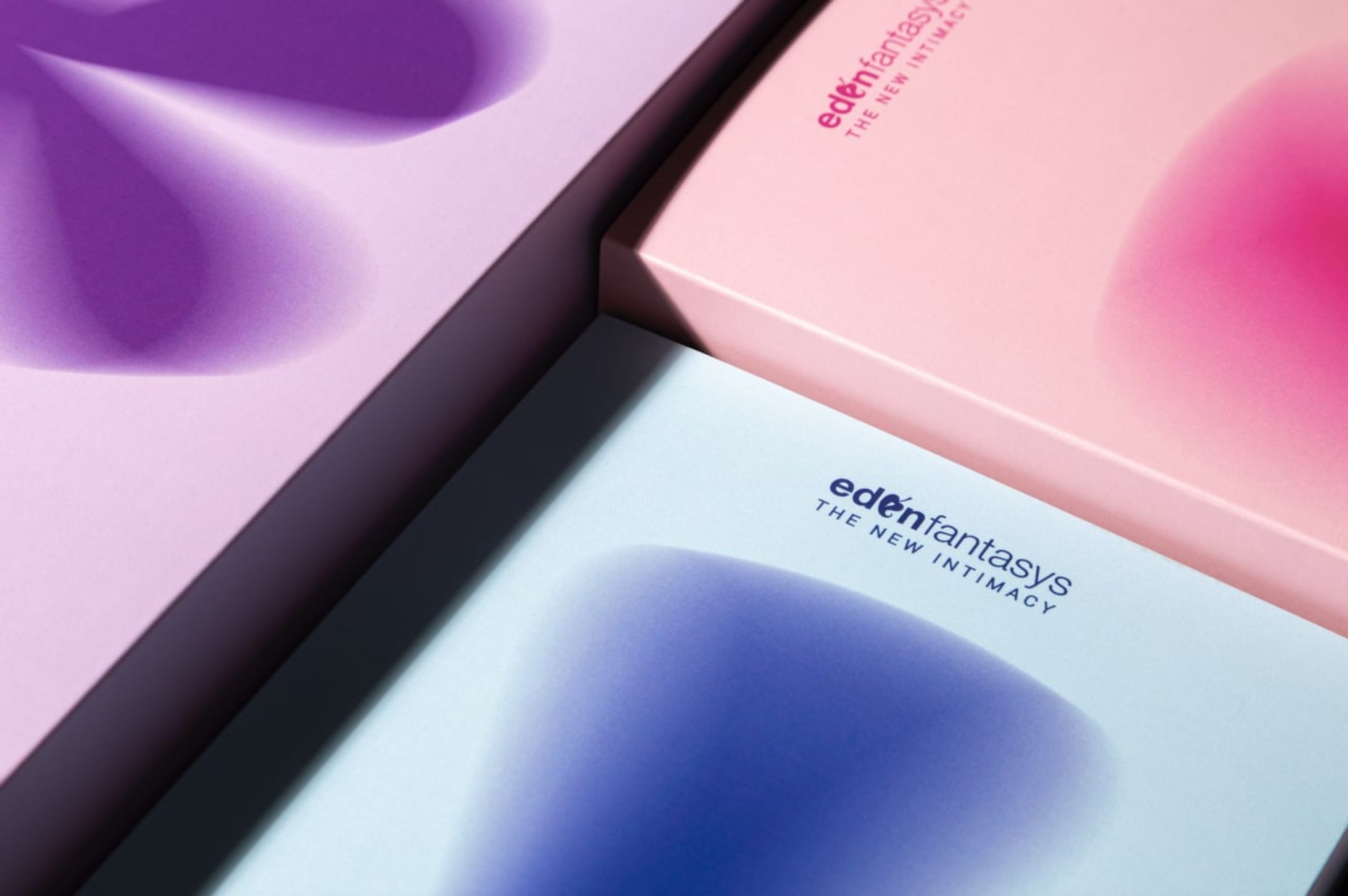
By integrating these ideas, the final visual was developed using a combination of vibration imagery, genital illustrations, and bright, fun, and happy colors to create an engaging and positive design.
パッケージのメインビジュアル制作のために、まず製品の機能や役割などのブレインストーミングを行い、それらを3つに要素に絞り統合した。1つは、製品の顕著な機能は「振動」だと考えた。2つ目に、「性器のどこ」に使うかを考え、3つ目は、使用したときに「どう感じるか(感情)」を考えた。
性器の振動+性器イラスト+明るくハッピーで楽しい色=すべてのアイデアを統合。
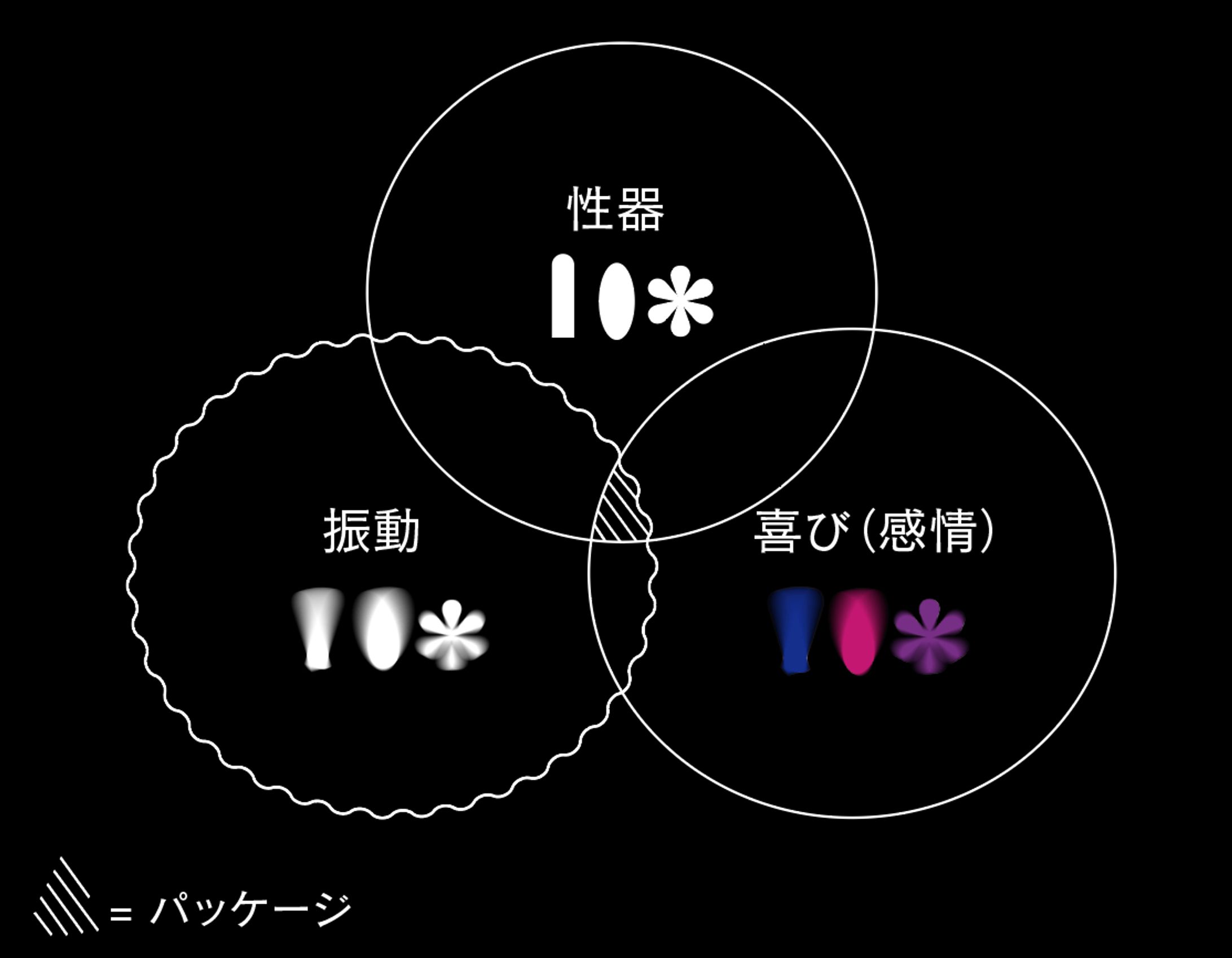
- Vibration – Function of the toy
- Genitals (anal, vaginal, penis) – Area of use
- Pleasure – Sensation and emotions the toy provides
The main visual was created by combining the image of vibration related to genitals and using vibrant, pop colors that evoke positive emotions.
1. 振動—玩具の機能
2. 性器(アナル、膣、ペニス)—使用する場所
3. 快感—玩具が与える感覚や感情
メインビジュアルは、「性器」の「振動のイメージ」、色はポジティブな気持ちにさせてくれる「ポップな色」を選ぶことで制作に至った。
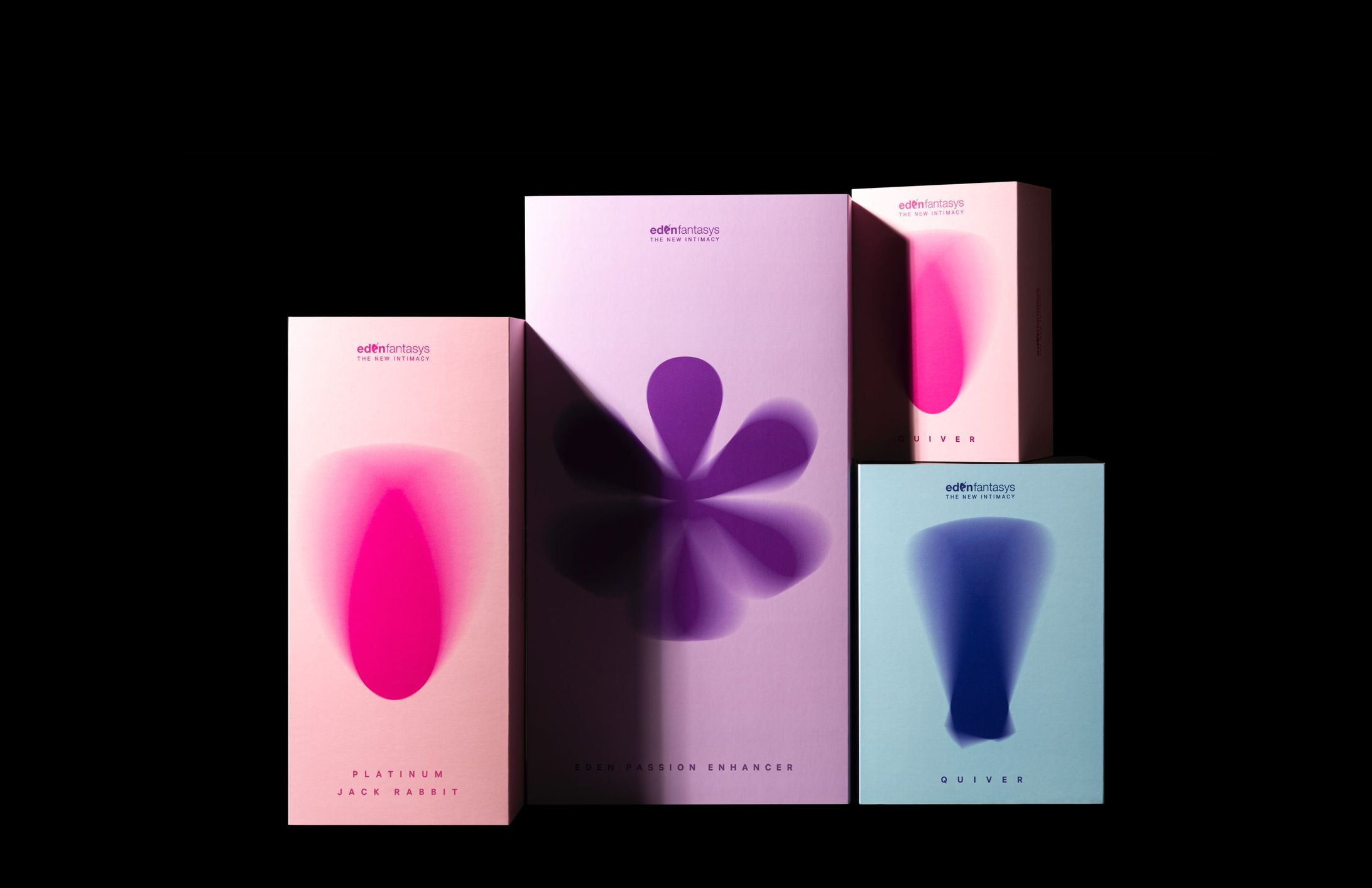
From left to right:
- Oval-shaped design – For women (vaginal use).
- Flower-like design – Unisex (anal use).
- Bullet-like design – For men (penile use).
↑ 左から:楕円形のデザインは女性用(ヴァギナ)、花のようなデザインは男女兼用(アナル)、弾丸のようなものは男性用(ペニス)。
もっとみる


