
Keyboard | Slim, Portable, "Slint"
クレジット

Designer
Keyboard | Slim, Portable, "Slint"
2024 グッドデザイン賞
https://www.g-mark.org/gallery/winners/25440
超軽量設計かつ軽快な打ち心地を保ちつつ、剛性設計をブラッシュアップし、不快感の原因となる筐体のしなりを大幅に低減。さらに部品レイアウトを見直し、このクラスでは希少な大型のスタンドを備え、高い可搬性と使いやすさを両立。かな表記を省いたフォントを採用し、ローマ字入力時にキーが見やすいミニマルなデザイン。
Ultra-lightweight design with enhanced rigidity and a satisfying keystroke feel.
While maintaining a light and responsive typing experience, the chassis has been refined to significantly reduce flexing—often a source of discomfort. The internal component layout has also been optimized, making room for a large stand rarely found in this class, achieving both portability and ease of use. The minimalist keycap design omits Japanese kana characters, ensuring better visibility and focus for users typing in Roman characters.
クレジット
Designer


あなたのforiioを無料で作成
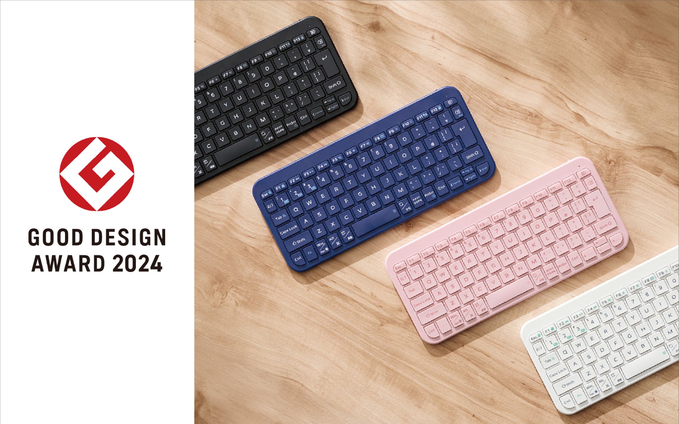
Keyboard | Slim, Portable, "Slint"
2024 グッドデザイン賞
https://www.g-mark.org/gallery/winners/25440
超軽量設計かつ軽快な打ち心地を保ちつつ、剛性設計をブラッシュアップし、不快感の原因となる筐体のしなりを大幅に低減。さらに部品レイアウトを見直し、このクラスでは希少な大型のスタンドを備え、高い可搬性と使いやすさを両立。かな表記を省いたフォントを採用し、ローマ字入力時にキーが見やすいミニマルなデザイン。
Ultra-lightweight design with enhanced rigidity and a satisfying keystroke feel.
While maintaining a light and responsive typing experience, the chassis has been refined to significantly reduce flexing—often a source of discomfort. The internal component layout has also been optimized, making room for a large stand rarely found in this class, achieving both portability and ease of use. The minimalist keycap design omits Japanese kana characters, ensuring better visibility and focus for users typing in Roman characters.
クレジット
Designer