SNS Banner: Aroma Time – Aroma Mist
クレジット
UI Designer
UX Designer
SNS Banner: Aroma Time – Aroma Mist
About the Design
Production Period:
1 day
Tools/Skills:
・Illustrator
・Photoshop
・ChatGPT
・Perplexity AI
・UI/UX
・Branding
・Marketing
Focus Points:
To achieve the main objective:
① Announce the launch of a new product
I applied the following design strategies:
① Announcing the New Product:
• Storytelling for the target audience:
To guide the audience through the journey of:
Noticing the banner → Becoming interested in the product → Learning about the release date,
I focused on the following points:
• To catch their attention:
→ Curved the “aroma time” text along a wavy line to make it stand out and evoke a sense of relaxation.
→ Noticing a recent trend where more women value their nighttime relaxation, and recognizing that most aroma mist usage occurs at night, I designed a nighttime theme by using a starry sky background with purple tones and moon motifs.
→ Applied a gradient from purple to pink.
• To make them interested in the new product:
→ Research revealed that the key differences between popular aroma mists and unpopular ones were alcohol content and skin-friendliness.
→ Therefore, I highlighted “Alcohol-Free” and “100% Natural Essential Oils” as key selling points.
→ Increased the brightness of the product image.
→ Used fonts such as fine serif fonts, soft Mincho-style fonts, modern fonts, and rounded Gothic fonts to convey a sense of relaxation, elegance, and cuteness, strengthening the product’s branding.
→ Added floral decorations to help visualize a pleasant scent.
→ Incorporated rounded elements throughout the design to evoke a soft, relaxing feeling.
• To communicate the release date:
→ Used a bold, modern typeface for strong visual impact.
→ Created color contrast by placing the rounded text background behind the release date information.
→ Positioned the release date in the bottom-right corner to create a natural flow of the viewer’s gaze.
⸻
Design Process
1. Define the design challenge
2. Extract keywords (to inspire design ideas)
3. Research the market (collecting data and surveys)
4. Deeply understand the target audience (through statistics and surveys)
5. Develop copy (catchphrases, etc.)
6. Brainstorm design ideas (using design galleries and the extracted keywords for layout, visuals, fonts, and colors)
7. Create and polish the design
8. Finalize
⸻
Design Challenge
Target Audience:
• Women in their 20s to 30s
• Trend-conscious individuals
Concept:
Deliver a precious moment of relaxation to busy everyday lives.
Objectives:
• Announce the new product
• Spark interest in the product
Desired Emotional Impact on the Audience:
• A sense of security
• A feeling of happiness
• A treat for themselves
Atmosphere:
• Cuteness
• Pleasant fragrance
• Relaxation
• Rewarding feeling
⸻
Thoughts on Design
“I want to convey love through design and help others express it.”
I love designing with the user’s feelings in mind—creating designs that are easy to use, easy to understand, and make people feel excited and happy.
I believe that designing while considering human emotions is one of the true joys and purposes of life.
That’s why I place the highest importance on “getting to know the person” first.
This is a fictional product. The image is for illustration purposes only.
クレジット
UI Designer
UX Designer


あなたのforiioを無料で作成
SNS Banner: Aroma Time – Aroma Mist
About the Design
Production Period:
1 day
Tools/Skills:
・Illustrator
・Photoshop
・ChatGPT
・Perplexity AI
・UI/UX
・Branding
・Marketing
Focus Points:
To achieve the main objective:
① Announce the launch of a new product
I applied the following design strategies:
① Announcing the New Product:
• Storytelling for the target audience:
To guide the audience through the journey of:
Noticing the banner → Becoming interested in the product → Learning about the release date,
I focused on the following points:
• To catch their attention:
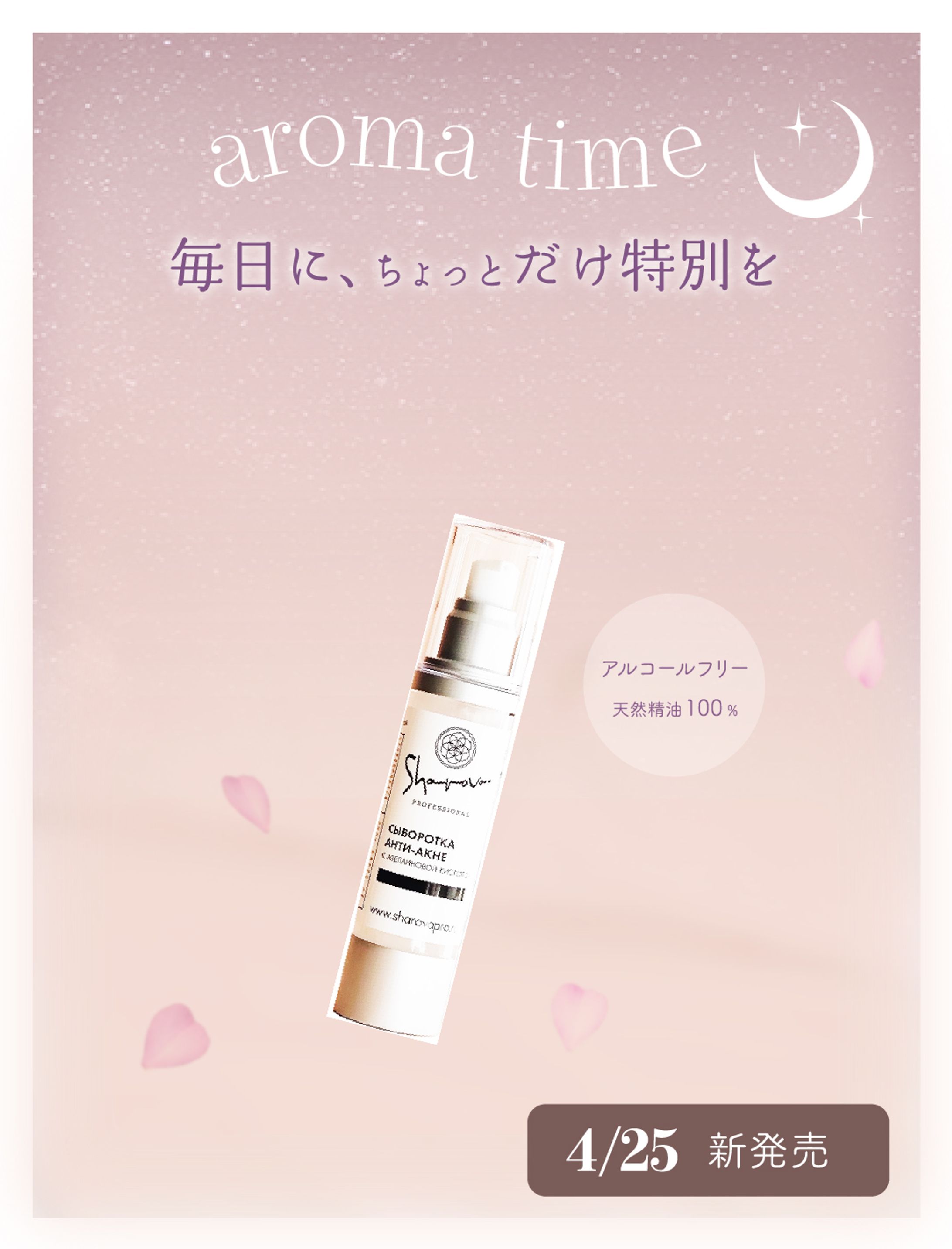
→ Curved the “aroma time” text along a wavy line to make it stand out and evoke a sense of relaxation.
→ Noticing a recent trend where more women value their nighttime relaxation, and recognizing that most aroma mist usage occurs at night, I designed a nighttime theme by using a starry sky background with purple tones and moon motifs.
→ Applied a gradient from purple to pink.
• To make them interested in the new product:
→ Research revealed that the key differences between popular aroma mists and unpopular ones were alcohol content and skin-friendliness.
→ Therefore, I highlighted “Alcohol-Free” and “100% Natural Essential Oils” as key selling points.
→ Increased the brightness of the product image.
→ Used fonts such as fine serif fonts, soft Mincho-style fonts, modern fonts, and rounded Gothic fonts to convey a sense of relaxation, elegance, and cuteness, strengthening the product’s branding.
→ Added floral decorations to help visualize a pleasant scent.
→ Incorporated rounded elements throughout the design to evoke a soft, relaxing feeling.
• To communicate the release date:
→ Used a bold, modern typeface for strong visual impact.
→ Created color contrast by placing the rounded text background behind the release date information.
→ Positioned the release date in the bottom-right corner to create a natural flow of the viewer’s gaze.
⸻
Design Process
1. Define the design challenge
2. Extract keywords (to inspire design ideas)
3. Research the market (collecting data and surveys)
4. Deeply understand the target audience (through statistics and surveys)
5. Develop copy (catchphrases, etc.)
6. Brainstorm design ideas (using design galleries and the extracted keywords for layout, visuals, fonts, and colors)
7. Create and polish the design
8. Finalize
⸻
Design Challenge
Target Audience:
• Women in their 20s to 30s
• Trend-conscious individuals
Concept:
Deliver a precious moment of relaxation to busy everyday lives.
Objectives:
• Announce the new product
• Spark interest in the product
Desired Emotional Impact on the Audience:
• A sense of security
• A feeling of happiness
• A treat for themselves
Atmosphere:
• Cuteness
• Pleasant fragrance
• Relaxation
• Rewarding feeling
⸻
Thoughts on Design
“I want to convey love through design and help others express it.”
I love designing with the user’s feelings in mind—creating designs that are easy to use, easy to understand, and make people feel excited and happy.
I believe that designing while considering human emotions is one of the true joys and purposes of life.
That’s why I place the highest importance on “getting to know the person” first.
This is a fictional product. The image is for illustration purposes only.
クレジット
UI Designer
UX Designer