プロフィールサイト
クレジット

デザイナー
CSS
@charset "UTF-8";
/* CSS Document */
html {
  font-size: 62.5%; /* 16px * 62.5% = 10px */
  width: 100%;
  box-sizing: border-box;
}
body {
  color: #804f38; /* RGB */
  font-family: "Futura", YuGothic, "游ゴシック", "Yu Gothic", "メイリオ", sans-serif;
  font-weight: 500;
  font-size: 1.6em;
  line-height: 2.4rem;
  text-align: center;
}
section h2 {
  font-size: 2.4rem;
}
a:hover {
  opacity: 0.5;
}
.none {
  display: none;
}
/*
see: http://html5doctor.com/html-5-reset-stylesheet/
html5doctor.com Reset Stylesheet
v1.6.1
Last Updated: 2010-09-17
Author: Richard Clark - http://richclarkdesign.com
Twitter: @rich_clark
*/
html, body, div, span, object, iframe,
h1, h2, h3, h4, h5, h6, p, blockquote, pre,
abbr, address, cite, code,
del, dfn, em, img, ins, kbd, q, samp,
small, strong, sub, sup, var,
b, i,
dl, dt, dd, ol, ul, li,
fieldset, form, label, legend,
table, caption, tbody, tfoot, thead, tr, th, td,
article, aside, canvas, details, figcaption, figure,
footer, header, hgroup, menu, nav, section, summary,
time, mark, audio, video {
margin:0;
padding:0;
border:0;
outline:0;
font-size:100%;
vertical-align:baseline;
background:transparent;
}
body {
line-height:1;
}
article,aside,details,figcaption,figure,
footer,header,hgroup,menu,nav,section {
display:block;
}
nav ul {
list-style:none;
}
blockquote, q {
quotes:none;
}
blockquote:before, blockquote:after,
q:before, q:after {
content:'';
content:none;
}
a {
margin:0;
padding:0;
font-size:100%;
vertical-align:baseline;
background:transparent;
}
/* change colours to suit your needs */
ins {
background-color:#ff9;
color:#000;
text-decoration:none;
}
/* change colours to suit your needs */
mark {
background-color:#ff9;
color:#000;
font-style:italic;
font-weight:bold;
}
del {
text-decoration: line-through;
}
abbr[title], dfn[title] {
border-bottom:1px dotted;
cursor:help;
}
table {
border-collapse:collapse;
border-spacing:0;
}
/* change border colour to suit your needs */
hr {
display:block;
height:1px;
border:0;
border-top:1px solid #cccccc;
margin:1em 0;
padding:0;
}
input, select {
vertical-align:middle;
}@charset "UTF-8";
/* CSS Document */
.header {
height: 44px;
background-color: #FFF;
position: relative;
}
.header h1 {
font-size: 1.3rem;
color: #aa8e81;
position: absolute;
left: 25px;
top: 10px;
}
.header_navigation {
display: none;
}
@media(max-width: 480px) {
#nav-drawer {
padding: 10px 24px 0 0;
text-align: right;
position: relative;
}
#nav-open {
display: inline-block;
vertical-align: middle;
width: 25px;
height: 22px;
}
#nav-open span, #nav-open span:before, #nav-open span:after {
position: absolute;
height: 3px;
width: 25px;
background-color: #804f38;
display: block;
content: "";
}
#nav-open span:before {
bottom: -8px;
}
#nav-open span:after {
bottom: -16px;
}
#nav-close {
z-index: 999;
position: fixed;
top: 0;
left: 0;
width: 100%;
height: 100%;
background-color: #FFF;
opacity: .5;
}
#nav-content {
display: block;
position: fixed;
top: 0;
left: 0;
z-index: 9999;
width: 70%;
height: 100%;
background-color: #e1d3d2;
text-align: left;
padding: 25px 0 0 24px;
transform: translateX(-105%);
transition: 0.3s ease-in-out;
box-shadow: 5px 0 25px rgba(0, 0, 0, 0.25)
}
.nav-drawer__title {
display: block;
font-size: 1.2rem;
font-weight: 600;
color: #FFF;
margin-bottom: 46px;
}
.nav-drawer__link-top {
display: block;
}
#nav-content ul li {
margin-bottom: 36px;
}
#nav-content ul li a {
text-decoration: none;
font-size: 1.6rem;
font-weight: 600;
color: #804f38;
}
#nav-input:checked ~ #nav-close {
display: block;
}
#nav-input:checked ~ #nav-content {
transform: translateX(0%)
}
}
@media(min-width: 480px) {
.header {
max-width: 1040px;
margin: 0 auto;
min-height: 50px;
padding: 14px;
box-sizing: border-box;
}
.header h1 {
font-size: 2rem;
top: 13px;
}
.header_navigation {
display: block;
text-align: right;
}
.header_navigation ul li {
display: inline-block;
margin-left: 50px;
}
.header_navigation ul li a {
text-decoration: none;
font-size: 2rem;
font-weight: 600;
color: #804f38;
}
}
.main {
background-color: #f8ebe9;
padding-bottom: 60px;
}
@media(min-width: 1040px) {
main {
padding-bottom: 120px;
}
}
.section-top {
margin-bottom: 60px;
}
.section-top__image {
height: 388px;
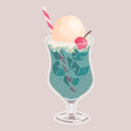
background-image: url("../assets/top/top-image.png");
background-position: 73% 60%;
background-size: auto 120%;
background-repeat: no-repeat;
color: #e1d3d2;
font-weight: 600;
position: relative;
}
.section-top__image h2 {
font-size: 4rem;
position: absolute;
width: 100%;
top: 140px;
color: #FFFFFF
}
.section-top__image-message {
position: absolute;
width: 100%;
top: 170px;
color: #FFF;
letter-spacing: 0.3rem;
}
@media(min-width: 1040px) {
.section-top__image {
height: 600px;
background-position: 70% 60%;
background-size: auto 120%;
margin-bottom: 80px;
}
.section-top__image h2 {
font-size: 7.2rem;
position: static;
max-width: 1040px;
margin: 0 auto;
text-align: center;
padding: 280px 30px 0 0;
}
.section-top__image-message {
font-size: 3.6rem;
font-weight: 100;
letter-spacing: 0.5rem;
position: static;
max-width: 1040px;
margin: 0 auto;
text-align: center;
padding: 30px 30px 0 0;
}
}
.section-about {
margin: 60px 0px 60px;
}
.section-about h2 {
margin-bottom: 40px;
font-size: 3.6rem;
font-weight: 600;
}
.section-about ul {
margin: 0 20px;
list-style: none;
}
.section-about ul li {
max-width: 327px;
margin: 0 auto;
background-color: #FFF;
border-radius: 20px;
text-align: center;
}
.section-about__title {
font-size: 1.8rem;
font-weight: 600;
letter-spacing: 0.2rem;
text-indent: 0.2rem;
padding: 20px 20px 18px;
}
.section-about__discription {
font-size: 1.5rem;
font-family: "Arial";
line-height: 3rem;
padding-bottom: 20px;
}
@media(min-width: 1040px) {
.section-about ul li {
max-width: 1040px;
}
.section-about ul {
max-width: 1040px;
margin: 0 auto;
}
.section-about h2 {
font-size: 4.5rem;
font-weight: 600;
margin-bottom: 40px;
}
.section-about__title {
font-size: 2.4rem;
padding: 30px 0 25px;
}
.sp {
display: none;
}
.section-about__discription {
font-size: 2rem;
padding-bottom: 30px;
}
}
.section-favorite {
margin-bottom: 60px;
}
.section-favorite h2 {
margin-bottom: 40px;
font-size: 3.6rem;
font-weight: 600;
}
.section-favorite ul {
margin: 0 20px;
list-style: none;
}
.section-favorite ul li {
max-width: 327px;
margin: 0 auto;
background-color: #FFF;
margin-bottom: 40px;
border-radius: 20px;
text-align: center;
}
.section-favorite__item-picture-travel {
width: 100%;
height: 186px;
object-fit: cover;
object-position: 0 0;
border-radius: 20px 20px 0 0;
}
.section-favorite__title {
padding: 20px 20px;
font-size: 2rem;
}
.section-favorite__title-discription {
padding: 0 18px 25px;
text-align: left;
line-height: 2.8rem;
font-family: "Arial";
}
.section-favorite__item-picture-illust {
width: 100%;
height: 186px;
object-fit: cover;
object-position: 50% 10%;
border-radius: 20px 20px 0 0;
}
.section-favorite__item-picture-game {
width: 100%;
height: 186px;
object-fit: cover;
object-position: 0 0;
border-radius: 20px 20px 0 0;
}
@media(min-width:1040px) {
.section-favorite {
margin-bottom: 60px;
}
.section-favorite h2 {
font-size: 4.5rem;
font-weight: 600;
margin-bottom: 40px;
}
.section-favorite ul {
max-width: 1040px;
margin: 0 auto;
padding: 0;
}
.section-favorite ul li {
max-width: 320px;
display: inline-block;
margin-right: 40px;
}
.section-favorite ul li:last-child {
margin-right: 0;
}
}
.section-access {
max-width: 327px;
margin: 0 auto;
background-color: #FFF;
border-radius: 20px;
margin-bottom: 60px;
}
.section-access h2 {
font-size: 3.6rem;
font-weight: 600;
padding: 40px 40px;
}
.section-access address {
font-style: normal;
font-family: "Arial";
padding:0 18px 40px;
}
.section-access__break {
display: block;
}
.section-access__break:after {
content: "\A";
white-space: pre;
}
.section-access__map {
height: 330px;
}
.section-access__map iframe {
width: 100%;
height: 100%;
border: solid 1px #804f38;
border-radius: 0 0 20px 20px;
}
@media(min-width: 1040px) {
.section-access {
margin: 0 auto 60px;
max-width: 1040px;
box-sizing: border-box;
padding: 60px 35px;
}
.section-access h2 {
font-size: 4.5rem;
font-weight: 600;
padding: 0 0 40px;
border-bottom: solid 1px #804f38;
margin-bottom: 40px;
}
.section-access__map {
max-width: 840px;
margin: 0 auto;
height: 340px;
}
.section-access__map iframe {
border-radius: 0;
}
}
.section-news {
max-width: 327px;
margin: 0 auto;
background-color: #FFF;
border-radius: 20px;
}
.section-news h2 {
font-size: 3.6rem;
font-weight: 600;
padding: 40px;
border-bottom: solid 1px #804f38;
margin: 0 20px 40px;
}
.section-news ol {
list-style: none;
}
.section-news ol li {
padding: 0 20px 40px;
text-align: left;
}
.section-news time {
font-weight: 600;
}
.section-news time::after {
content: ":";
}
.section-news h3 {
display: inline;
}
@media(min-width: 1040px) {
.section-news {
margin: 0 auto 60px;
max-width: 1040px;
box-sizing: border-box;
padding: 60px 35px 20px;
}
.section-news h2 {
font-size: 4.5rem;
font-weight: 600;
padding: 0 0 40px;
border-bottom: solid 1px #804f38;
margin-bottom: 40px;
}
.section-news ol {
max-width: 840px;
margin: 0 auto;
}
}
.footer {
min-height: 240px;
background-color: #b99e92;
padding-top: 45px;
padding-bottom: 30px;
font-weight: 600;
}
.footer__site-map {
margin-bottom: 30px;
}
.footer__site-map h2 {
display: none;
}
.footer__site-map li {
margin: 0 10px;
display: inline-block;
}
.footer__site-map li a {
text-decoration: none;
color: #f2e2d2;
}
.footer__site-map li a:visited {
color: #f2e2d2;
}
.footer__sns-links {
margin-bottom: 80px;
}
.footer__sns-links li {
display: inline-block;
width: 20px;
margin: 0 10px;
}
.footer__sns-links li img {
width: 100%;
}
.footer small {
color: #fefefe;
}
@media(min-width: 1040px) {
.footer {
margin: 0;
padding: 0;
}
.footer__container {
max-width: 1040px;
margin: 0 auto;
padding-top: 40px;
text-align: left;
}
.footer__site-map {
float: left;
}
.footer__site-map h2 {
display: inline-block;
width: 120px;
vertical-align: top;
color: #FFF;
}
.footer__site-map ul {
display: inline-block;
margin-left: 10px;
}
.footer__site-map ul li {
display: block;
margin: 0;
}
.footer__sns-links {
float: right;
}
.footer small {
clear: both;
display: block;
text-align: center;
}
}制作過程
もっとみる
HTML
もっとみる


あなたのforiioを無料で作成