Mof Photography
クレジット

Graphic Designer
Process

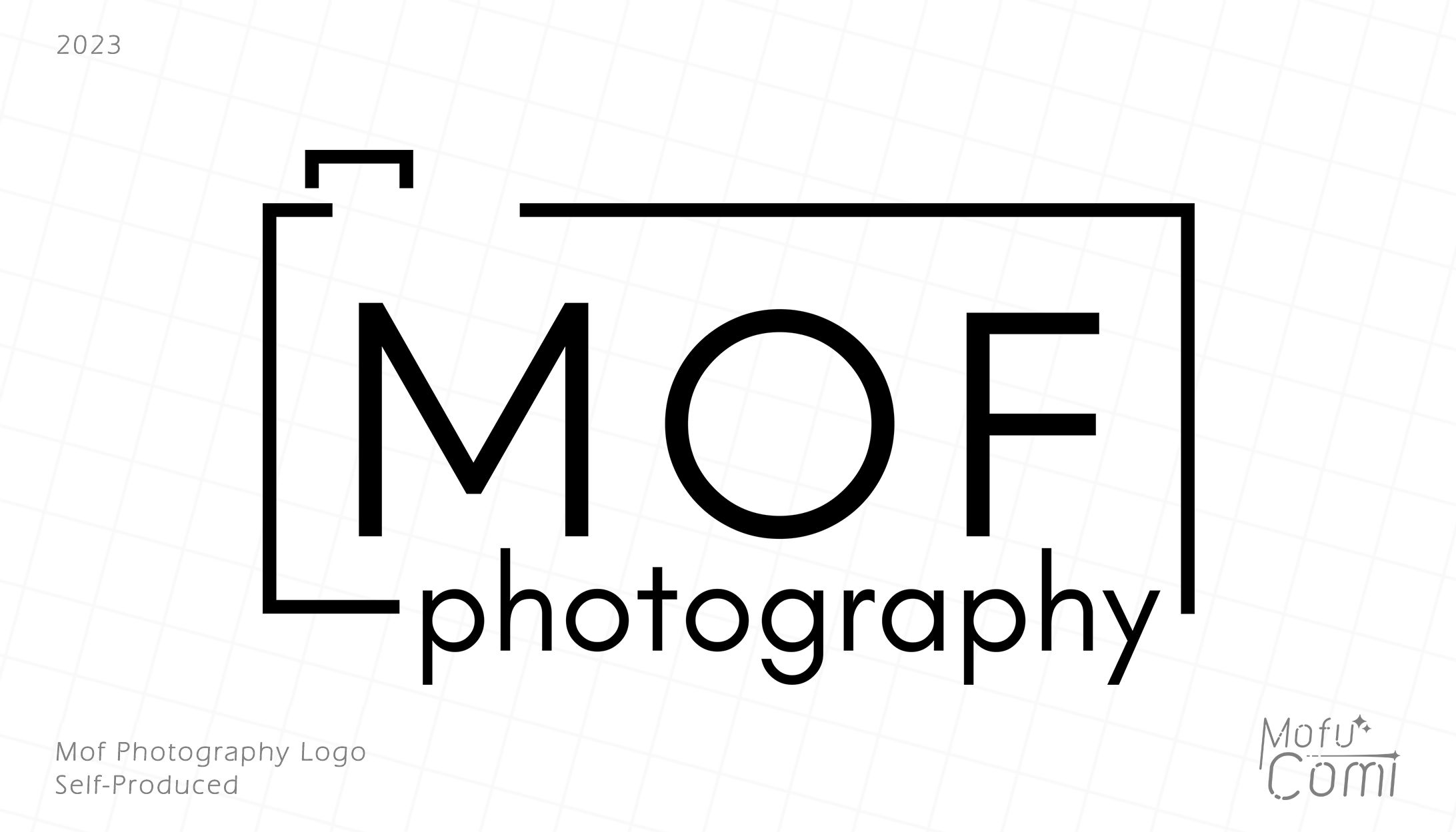
This was a logo produced for my photography hobby.
•I chose the font "Glacial Indifference" for the text due to it's shape structure. I enjoyed the blunt and readable aspects of the font, and wanted to make something that really felt professional and upfront.
•The camera concept was purely accidental, but I'm really happy with it.
•Leaving some space around the camera's "button" helps to reduce visual clutter in the top left corner.
•I actively chose not to center the "O" of "MOF" in the center of the camera, since it brought the "M" far too close to the border than I had liked.
•The weight of the logo is balanced nicely by the elements in the top left and bottom right corner.


あなたのforiioを無料で作成