MofuComi


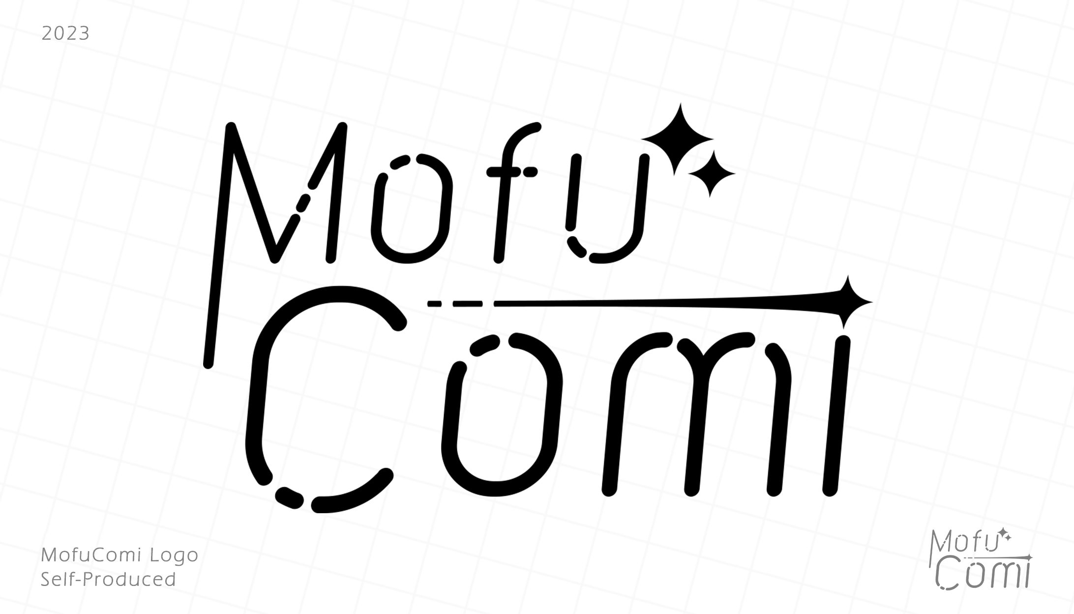
Early 2023 I decided to finally start a business myself. I wanted something to show the world, and I wanted to leave a lasting impact on others. So, "MofuComi" was born. I originally wanted to go for a Vtuber-esque design with lots of colors and shapes, but ended up settling for a much more elegant, refined, and focused design.
•I went with the font "BOKEH," which I chose for it's rounded, elegant curves and unique breaks in the text elements. I fell in love with this font on first sight and knew it would be perfect for this project.
•The stars in the design come from a character very dear to my heart. This character serves as my online persona across many platforms, so I wished to incorporate it in some form.
•I chose to use a shooting star design for the dot of the I to bridge the gap between the two text elements. I also incorporated small gaps in the star's tail to match the font.
•I extended the left side of the "M" in order to help make the text elements flow together.
•I very slightly reduced the size of the "omi" in "Comi" to help bring emphasis to the "C."
•I chose to use a minimal number of elements in order to hone-in on the professional aesthetic I wished to achieve.
Overall, I am incredibly happy with how this design turned out, and I am proud to have it be the face of my work.


あなたのforiioを無料で作成