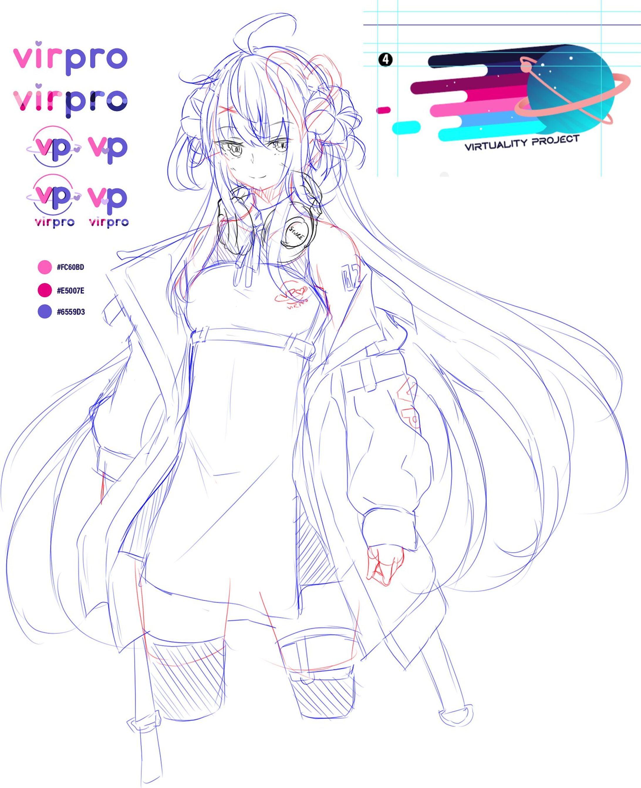
VP-Chan* - Character Design

As part of the new Virpro rebranding, I worked on and collaborated with the team to create a new logo. Alongside with this, I also worked to create other graphics to be used as well, something simple to use for announcements and schedules. The character mascot design (VP-Chan, name pending) was also a completely random side project I wanted to have done as part of my design showcase (I did not want to have an empty spot and I did not have a fitting placeholder illustration to use for my overlay design samples).
As is the case with all/ most of my designs, I already had an idea in mind. The hairstyle and heterochromia and split-colour hair was something I already envisioned and immediately drafted out. There were some challenges figuring out aesthetically what designs I could do for her overall outfit, but I decided to keep it moderately futuristic: from her inner plugsuit dress to her neck-collar speakers (which were originally just plain headphones). She also sports a cargo jacket that stylistically resembles an astronaut space suit (sort of). On her messenger bag (while the details may be small to see/ notice), there are also 4 buttons and a mascot keychain; each of these resemble the current Virpro talents.
Coming up with the colour scheme is where it gets fun. Primarily, a majority of the colours were sampled from iterations of the logo design. While things like her hair and eyes used the same base swatch from the logo (with the eyes having a bit more contrast), things like the skirt patterns and jacket tags used a design from an older logo design portraying a planet with vibrant motion lines. It was a design that I felt may have been too illustrative and would have issues with scalability, however was very colourful and had a nice contrast. With the logo design coupled with the outer space aesthetic, the rest of her design followed this style. A lot of the subtle overlays (in her hair, the inner layer of her hair and parts of her dress) are actually a space nebula pattern.
The heart tattoo on her left shoulder is an homage and the 02 is a reference to this being the second iteration (as we had initially retired but brought back) the VirPro group -- this time less of an agency and more of a place for all of us to collab and hang out.
もっとみる


あなたのforiioを無料で作成