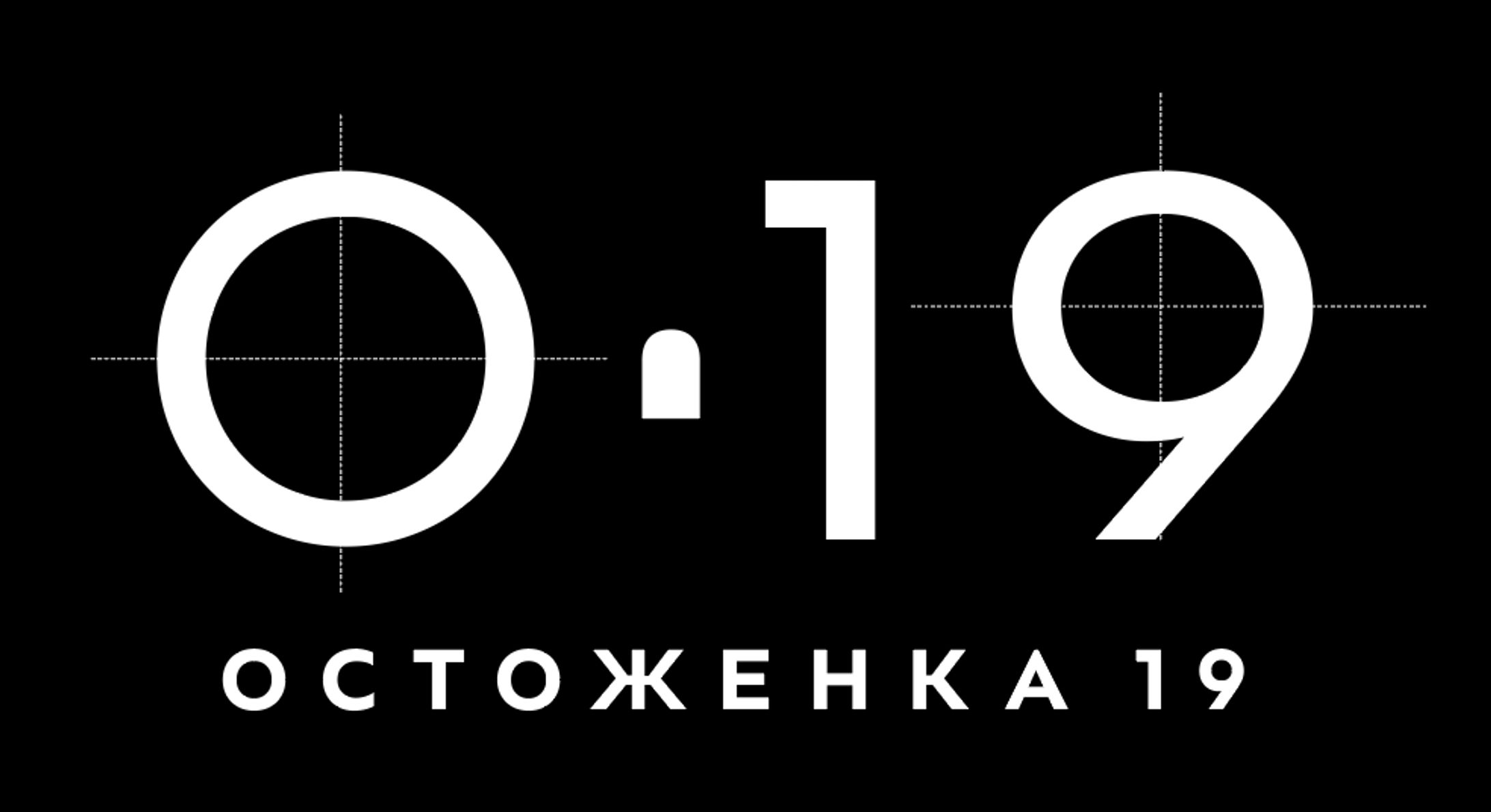
Ostozhenka19のブランドアイデンティティ / Brand identity for Ostozhenka 19 —new modern business centre

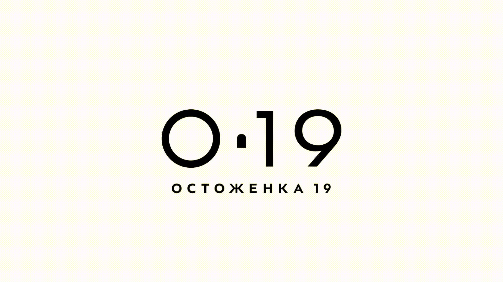

The brief said that Ostozhenka was an elegant historic building and a modern business centre. So, I came up with a logo that described both.
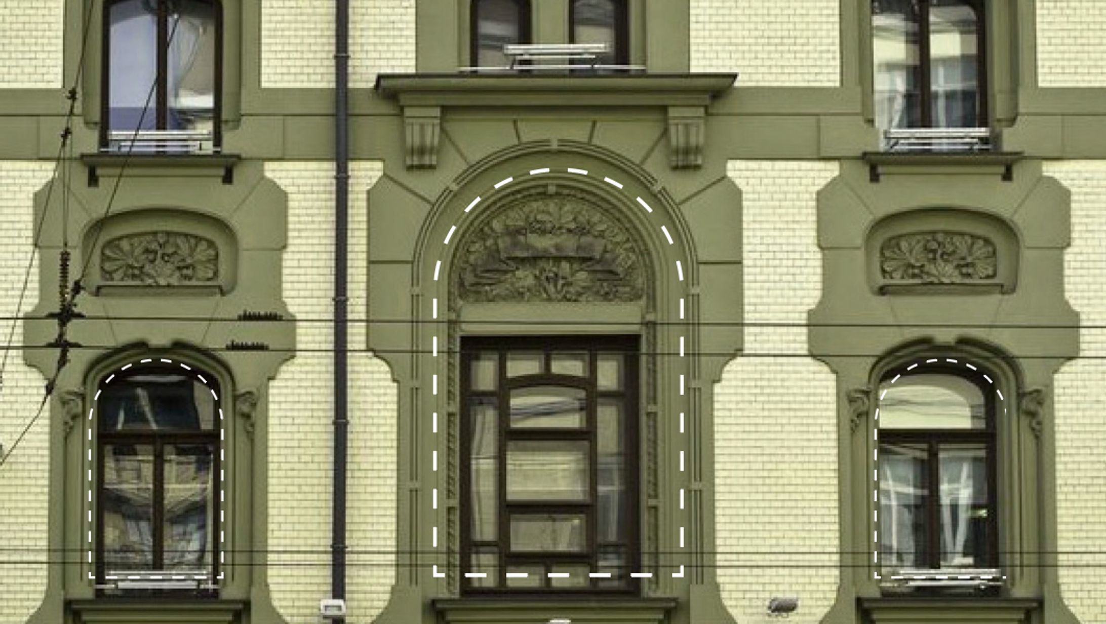
Ostozenka itself is a beautiful building built in the early 20th century. The logo I made for Ostozenka reminds people of its beautiful building structure. I used one of the iconic windows from their building as a symbol of this logo. The logo recreates the outline of the original window frame on the building's facade. (like the picture upper centre) I chose a window for this part of the logo because I thought that the window symbolizes openness to the world. I thought it matches the business centre's theme (or meaning).
Ostozenkaは20世紀初頭に建てられた美しい歴史的建造物であるが、建物内部には現代的なビジネスセンターもある。
そこで、その両方を表すロゴはどうかと考えた。まずロゴには、建物の象徴的な窓をシンボルの一部として使用した。(ロゴは建物のファサードにある窓枠の輪郭を再現している。)
また、この部分に窓を選んだのは、窓が世界に対してオープンであること象徴していると考えたからで、ビジネスセンターとしての存在意義にも合致していると思った。
歴史的建物の要素と、ビジネスセンターの象徴として窓をポイントとした。
The circles
At the core of the logo are expressive circles. I thought about what a business centre should be and came up with an image of a round shape that evokes meetings or gatherings and encourages good discussion. I also asked the font designer to custom-design the rounded letters for us for the final touch.
円の部分
ロゴの核となるのは、「円」。ビジネスセンターとはどうあるべきかを考えたとき、丸い形が会議や、良い議論ができるような集まりを連想させ最適と考えた。最後の仕上げとして、フォントデザイナーに丸みを帯びた文字のデザイン制作をお願いした。