Mend It Mineのブランドアイデンティティ / Brand Identity for Mend It Mine


Solution
I aimed to create a fun and exciting impression with the design.
Since "mending" and "repairing" can also symbolize "rebirth" and transformation, I chose a bright and uplifting tone. Additionally, as mending is often perceived as a dull or tedious task, I wanted to challenge that notion by designing something simple, joyful, and engaging for people to enjoy.
Initially, I was only commissioned to design the logo, but to maximize its impact and consider its usability, I proposed additional patterns, illustrations, and social media applications featuring the logo. As a result, the brand's story became clearer and more cohesive, which was highly appreciated by the client.
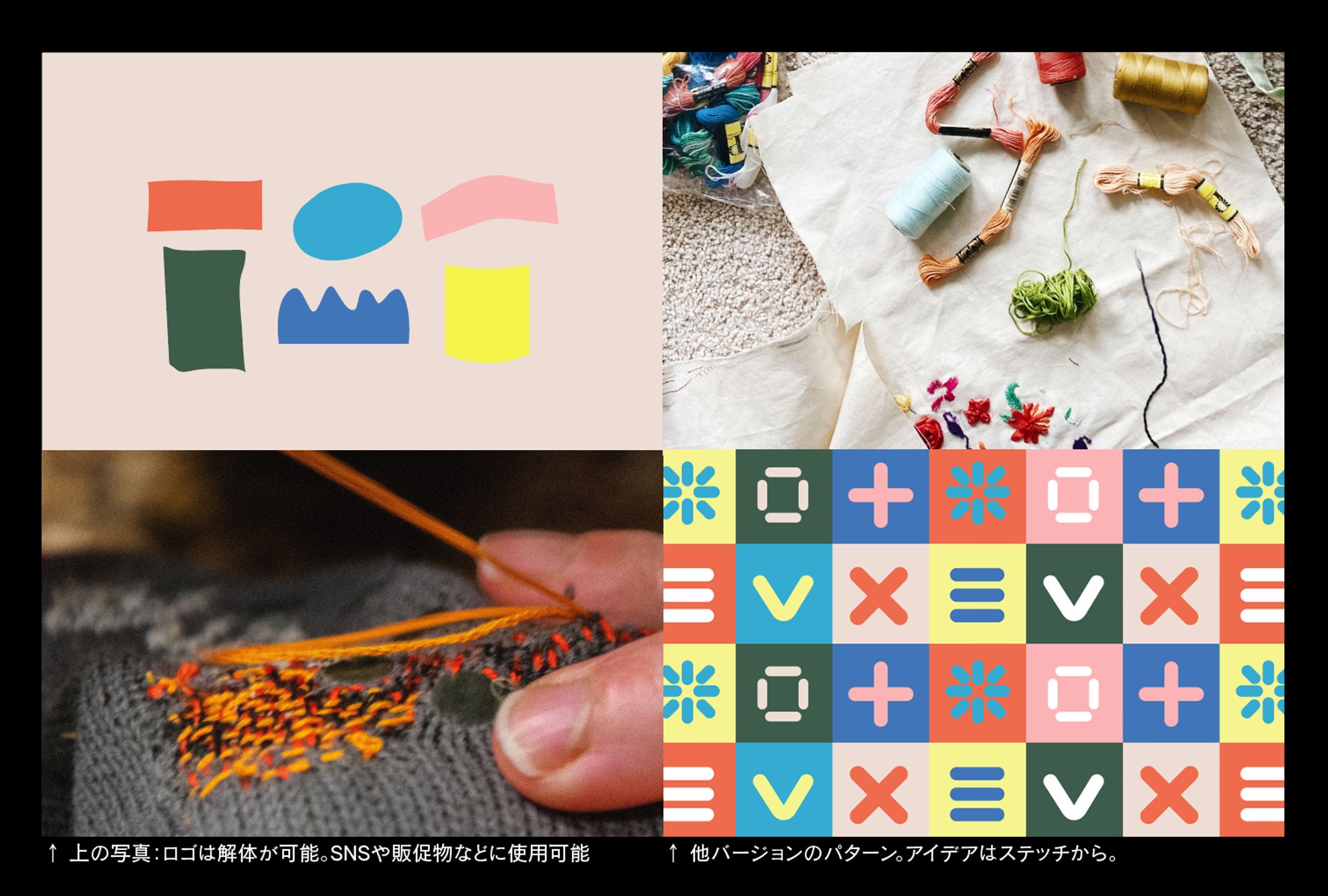
ソリューション
楽しくワクワクするような印象を作るよう心がけた。
「繕う」「直す」とは「生まれ変わる」という意味もあると思うので、明るいトーンにした。また、「繕いごと」は退屈なものというイメージがあるので、そのイメージを覆すようなシンプルで、人々に楽しんでもらえるハッピーな感じのものを制作した。
元々はロゴのデザインのみを依頼されたが、このロゴが最大限に活きるよう、且つ、ロゴを使用する側のことを考慮をした上で、追加でパターンやイラスト、それらを使用したSNSの使用例などを提案。結果、ブランドのストーリーがよく分かるようになったと、好評を得た。