露韓友好30周年記念のプロモーションデザイン / Promotion Design for Korean Cultural Centre

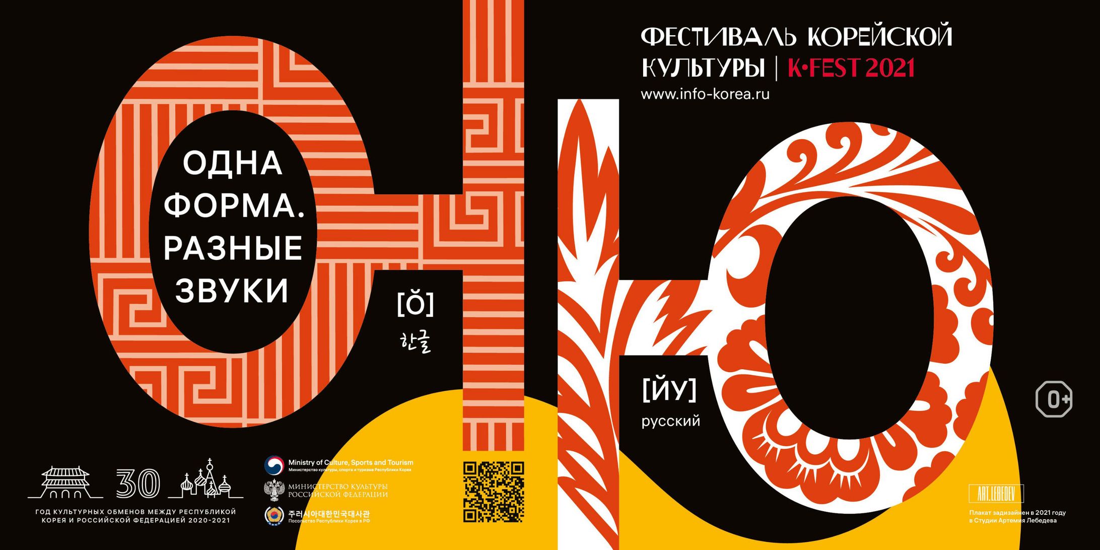


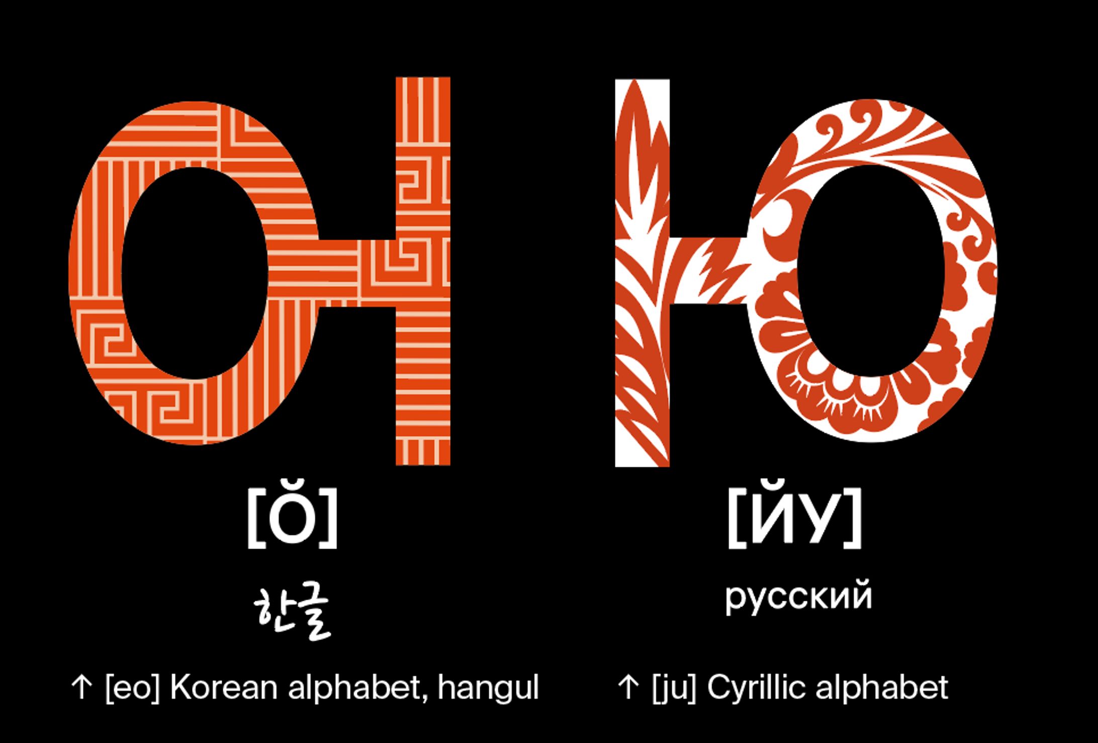
↑ "Одна форма, разные звуки" means "Same shape, different sound" in English.
"Одна форма, разные звуки" は 「同じ形で違う音」 という意味である。
1. Language × Poster
Instead of simply listing words, I developed a concept with deeper visual meaning.
Focusing on the theme of friendship between Russia and Korea, I explored linguistic similarities and discovered visual resemblances between certain Korean and Cyrillic characters.
These shared forms evoke a sense of familiarity and connection.
By using them as symbolic bridges between the two cultures, I visually expressed the idea of friendship through language.
1. 言語 × ポスター
単なる言葉の羅列のような表現ではなく、より深い視点から構成した。
ロシアと韓国の「友好」をテーマに、両国の言語に共通する要素を探し、キリル文字とハングルにある似た形の文字に着目した。
視覚的な共通性は、親しみや近しさを想起させる。
この類似性を、両国の文化をつなぐシンボルとして扱い、言語を通じて「友好」を視覚的に表現した。
2. Copywriting
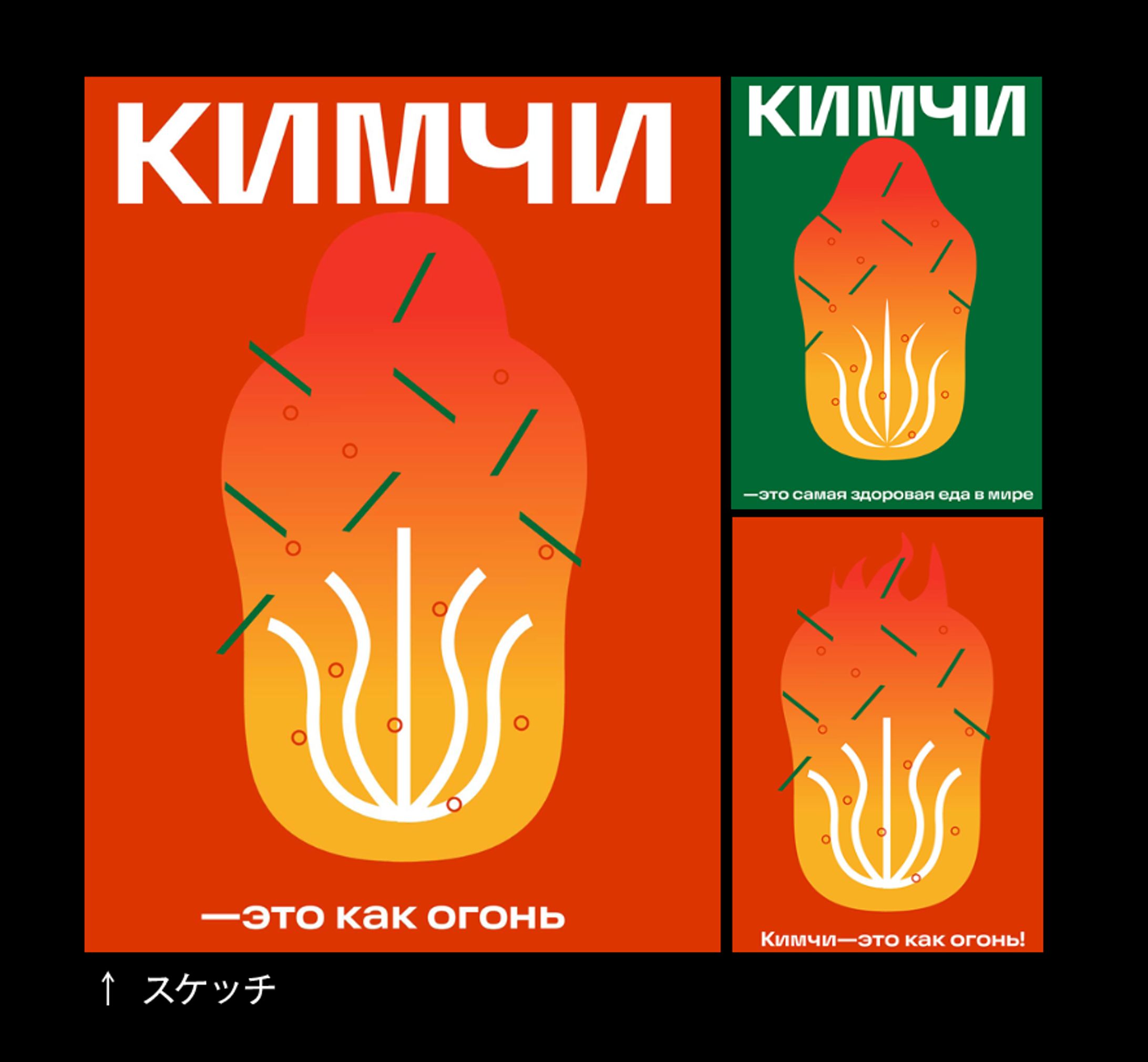
I was responsible for the concept development, copywriting, and overall visual design for this project, themed around the iconic Korean dish, kimchi.
The illustration was primarily drawn by me, with some final touches and additional elements created by an intern during the last stage.
The headline reads: “Кимчи — это огонь!” (Kimchi — it’s fire!)
In Russian, the word “Огонь” has two meanings:
- “fire” in the literal sense, and
- a slang term meaning “awesome” or “cool.”
This double meaning allowed me to express both the spicy heat of kimchi and its trendy, youthful image.
The client appreciated the wordplay, and the concept was selected as the main visual for the project.
It was a small act of visual translation — connecting languages and cultures through design.
2. コピーライティング
韓国を代表する料理「キムチ」をテーマに、コンセプト立案、コピーライティング、ビジュアル制作を担当した。
イラストは自ら描き、最終段階で一部の追加イラストのみインターンが制作を補助した。
見出しは「Кимчи — это огонь!(キムチ=オゴーニ!)」
このロシア語“Огонь”には2つの意味がある。
1つ目は「炎(fire)」という文字通りの意味、
2つ目は若者言葉で「最高」「イケてる」(awesome/cool)というスラング的な意味。
このダブルミーニングを活かすことで、キムチの辛さ(炎)と、
若者文化におけるトレンド感(クールさ)の両方を視覚的に表現した。
クライアントにも好評で、プロジェクトのメインビジュアルとして採用された。