ラーメン店 HP
クレジット

Webデザイン
中華そば 麒麟(KIRIN)HP

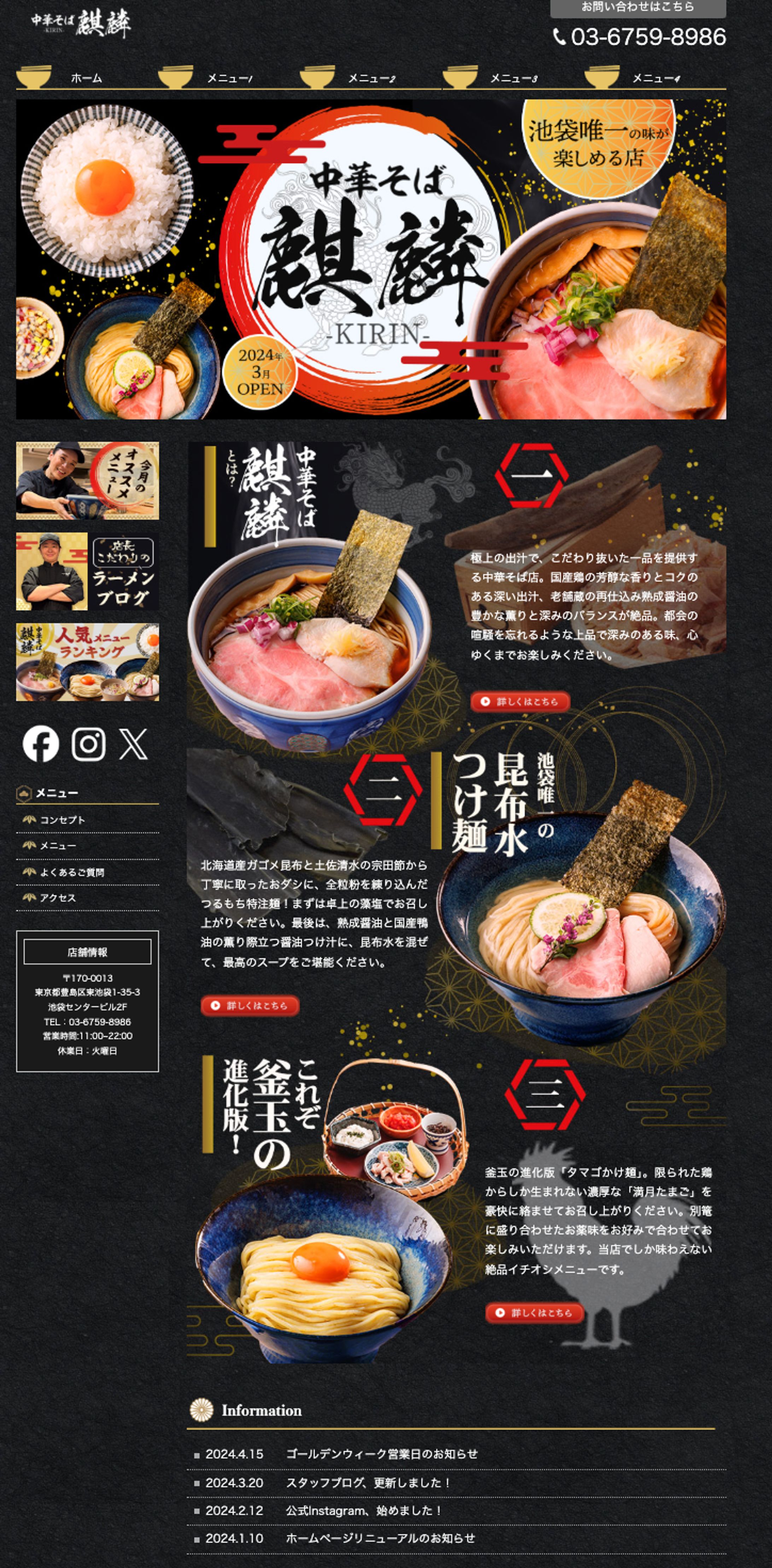
池袋にオープンした中華そば専門店「麒麟(KIRIN)」のブランドサイトとして制作しました。
コンセプトは「伝統と革新を融合させた本格ラーメンの世界観を、上質に表現する」。 ラーメンの持つ“職人のこだわり”と“高級感のある味わい”を、ビジュアルとタイポグラフィで訴求しています。
デザインコンセプト
- 黒×金×朱を基調に、和の格式と重厚感を演出。金粉のような装飾をあしらい、上質で特別感のある世界観を表現しました。
- 背景には、龍や和紋様のグラフィックをさりげなく配置し、伝統と高級感を両立しました。
- 力強い筆文字ロゴと円形の朱印モチーフを中心に据え、ブランドの象徴として印象的に仕上げています。
構成・情報設計
- ファーストビュー 看板メニューである中華そばを大きく配置し、視覚的に「味へのこだわり」を伝える構成。 「池袋唯一の味」「2024年3月OPEN」といったキャッチで、希少性と話題性を強調しています。
- メニュー紹介エリア 代表メニュー「昆布水つけ麺」「釜玉の進化版」などを美しい写真と詳細な説明で紹介。 食材・出汁・調理法など、職人のこだわりが伝わる文章構成にしています。
- 店舗情報/ブログ/SNS導線 フッターエリアに、Instagramやスタッフブログなどの情報をまとめて配置し、 「食べに行きたくなる」「店をもっと知りたくなる」導線設計を意識しました。
- ニュース・更新情報 オープン告知や最新情報を一覧で表示し、常に動きのあるサイトを演出しています。
トーン&スタイル
- 写真の質感とライティングにこだわり、湯気や麺の艶など「食欲をそそるリアリティ」を重視しました。
- 全体的に落ち着いたトーンながらも、視線を誘導するアクセントカラー(朱)でメリハリを演出しました。
- 伝統的な和の要素と現代的な洗練さを融合し、「一流の一杯」を感じさせるデザインに仕上げました。
目的
- ブランドの世界観を確立し、「池袋唯一の特別な中華そば」としての印象を強化。
- 高品質なビジュアルを通して、味・香り・職人技の魅力を視覚的に伝えることを目指しました。
- Webサイトを通じて店舗への来店動機を高める、ブランディング強化型サイトです。
This website was designed for “Chuka Soba KIRIN”, a premium ramen restaurant located in Ikebukuro, Tokyo. The concept centers on “a refined fusion of tradition and innovation,” capturing the essence of authentic Japanese craftsmanship and high-quality taste through elegant visuals and bold typography.
Design Concept
- The color palette of black, gold, and vermilion conveys a sense of sophistication and depth, while reflecting the brand’s traditional Japanese identity.
- Subtle motifs such as dragons and traditional patterns are integrated into the background to evoke heritage and luxury.
- The powerful brush-style logo and circular vermilion emblem serve as the brand’s symbolic focal point, establishing a memorable visual identity.
Structure & Layout
- Hero Section The main dish is prominently displayed to immediately capture attention and communicate the restaurant’s dedication to craftsmanship. The tagline “The only flavor in Ikebukuro” and “Opening March 2024” highlight both exclusivity and fresh appeal.
- Menu Introduction Signature dishes such as “Kombu Water Tsukemen” and “Evolved Tamago Bowl” are showcased with high-quality imagery and detailed descriptions emphasizing ingredient quality, preparation, and balance.
- Store & Community Information Social media links, blog updates, and store details are clearly organized to strengthen engagement and drive foot traffic.
- News & Updates Section The information area lists announcements and updates, giving the website a sense of ongoing activity and freshness.
Tone & Style
- The photography focuses on texture and warmth, highlighting steam, broth, and noodles to stimulate appetite.
- The overall tone is refined and calm, enhanced by dynamic accents of vermilion that guide user attention.
- The design merges traditional Japanese aesthetics with a modern digital presentation, creating an atmosphere of authenticity and excellence.
Goals
- Establish a strong brand identity for “KIRIN” as a one-of-a-kind ramen experience in Ikebukuro.
- Communicate the artisan spirit and depth of flavor visually and emotionally.
- Strengthen customer engagement through a cohesive and memorable brand-driven web experience.


あなたのforiioを無料で作成