My Mattress Store


This design was made early 2023 for a family-run mattress store in my town. They had a few issues with the previous iteration of their logo, and wanted to rebrand completely. "My Mattress Store" is the name they have chosen, and it was my goal to bring that to life.
The issues they held with their previous logo was that:
•The design did not incorporate the products they were trying to sell.
•The design was not recognizable enough.
•The design was not approachable.
My approach was simple:
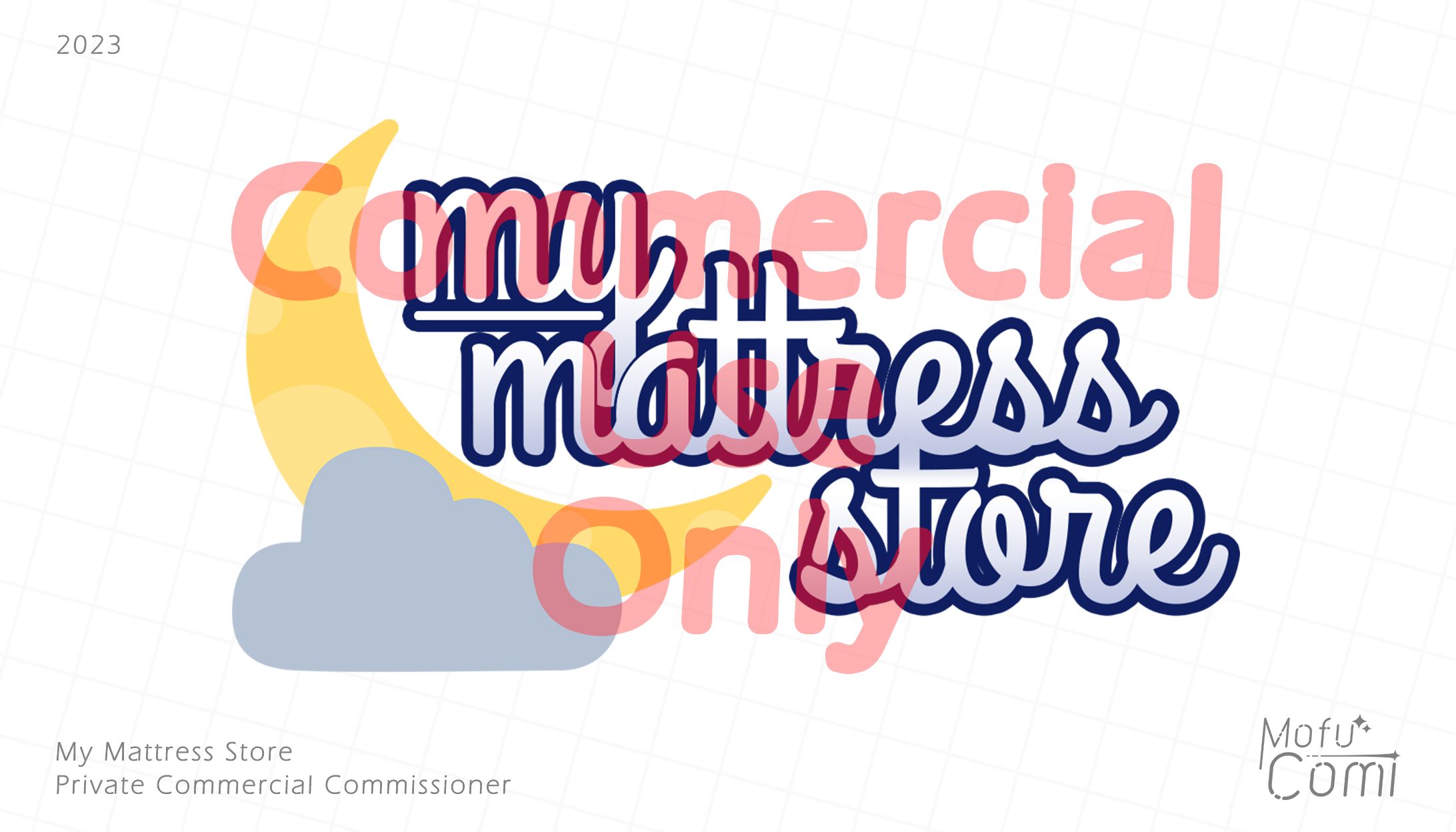
•I went with the "Grand Hotel" font, since I wanted something that instilled the feeling of a small-town, family owned business. The font's style also demonstrates commercial values such as cleanliness and elegance.
•A gradient, stroke, and underline was added to improve readability from a distance and improve the separation between design elements.
•The graphic on the left was designed to provide an eye-catching symbol that people would associate with the store and the product. Given that mattresses were sold here, I went with a traditional crescent moon behind a cloud. I ensured the colors would contrast nicely on a white sign.
Overall I had a very pleasant experience working on this design, and I'm very pleased with how it turned out.


あなたのforiioを無料で作成